The goal was to enhance the user experience for millennials (25 - 40 years old) and Gen Z (18 - 25 years old), and increase lead conversions for their bank.

Background
This project was part of an online course, Harness Projects, for which their client was Heritage Bank. I was one of four other UI Designers to create a new website for their merger bank with People First Choice, People First Bank as a cool, engaging new bank, attracting a younger audience. Our job was to synthesise their user research to conceptualise 4 unique website designs for them, by conducting competitor research, and conducting 2 rounds of usability testing on our designs.

DISCOVERY
Revamping Banking: Building a Fresh, Youthful Brand with a Member-First Approach
Heritage Bank began by working with a team of UX Researchers to gather insights on millennials' behaviours, preferences, and perceptions related to banking. The researchers aimed to:
Understand millennials' behaviour and attitudes towards banking
Identify key "push/pull" factors influencing their choice of bank
Assess the level of awareness millennials have about ‘mutual banks'
The insights that I found from their user interviews and surveys with the target audience revealed that:
I created one proto persona based on user research for this particular case study and the specific problem that I've focused on.

To address both the users' and business goals, I framed a How Might We statement:
How might we design an intuitive and user-friendly mobile website that communicates our features and rates, ensuring a convenient online banking experience that builds trust with potential customers?
Identifying opportunities
Neobanks like Revolut, Neo and Up are thriving in recent years, and it's partly due to their popularity among Gen Z and millennials. Unlike regular banking apps that offer services such as account management and long-term savings, these apps provide a full digital wallet experience, as well as savings pots, budgeting tools, and 3rd party integrations. Communicating how People First Bank can emulate a similar experience, their product offerings need to entice these audiences. Designing digital features of their app, along with these design principles, can make their website intuitive and engaging to users, including:
The website should be easy to use and accessible to a diverse audience, communicating the bank's USP
Easy navigation to find the bank's products
A quick, easy and simplified sign-up process
Design interactive elements to engage users
Here is a heuristic analysis of the three banks

Provide familiarity and ease of navigating a new website
I also conducted a card sorting exercise to provide familiarity and ease of navigating a new website to existing customers of Heritage Bank and People Choice. Using both banks' menu item words in this exercise also allows me to capture insights into new users and how they assign and group these items.

Using Lyssna, 5 participants aged 29 - 31 delivered the following results. I discovered that users found two ways they group items:
Grouping several items under Personal, Business and other categories or
Grouping items under product offering names e.g. Accounts, Loans, Online Banking, etc.

A sitemap was then created to identify our users and group their respective categories together.

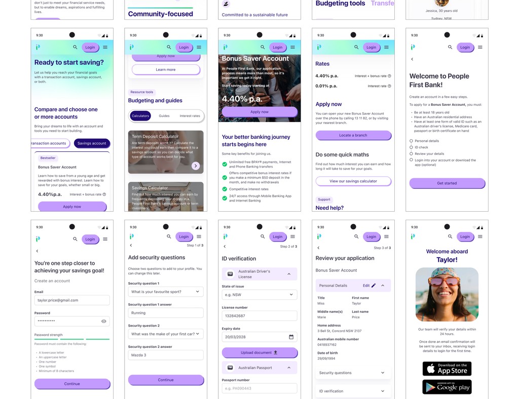
This is a refined user flow that was created to show how easy it is to open a savings account and join the bank.

Design and Validate
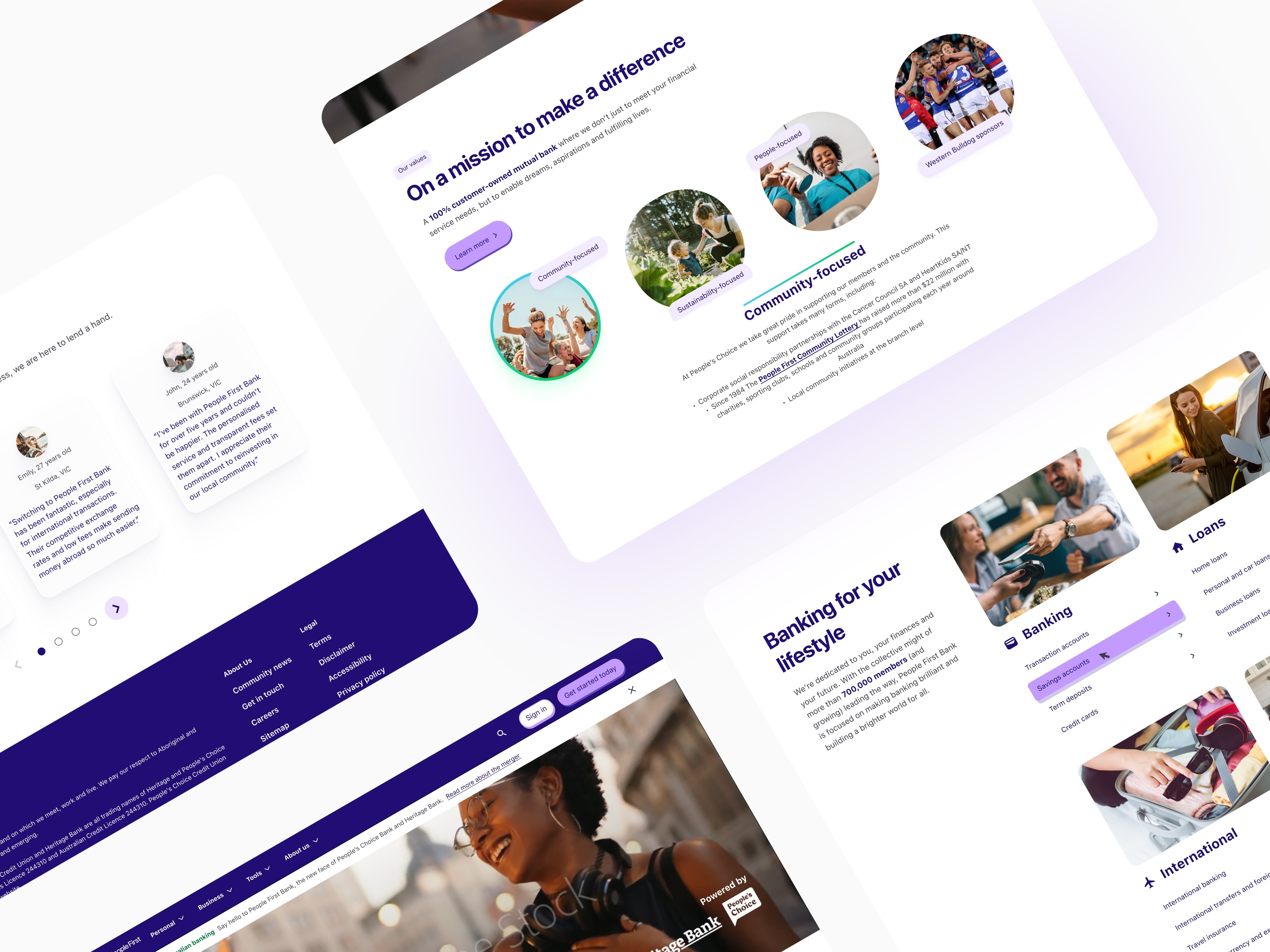
Using customer testimonials, the bank's security methods during the sign-up process and showing budgeting features of the bank's services helped to strengthen the bank's trust with new and current customers.


Iteration 1 - I started with the Crazy 8 activity to come up with many possible solutions for the How Might We statement for the home page and product pages. Some possible solutions included: total number of customers, customer testimonials, and social and environmental initiatives.
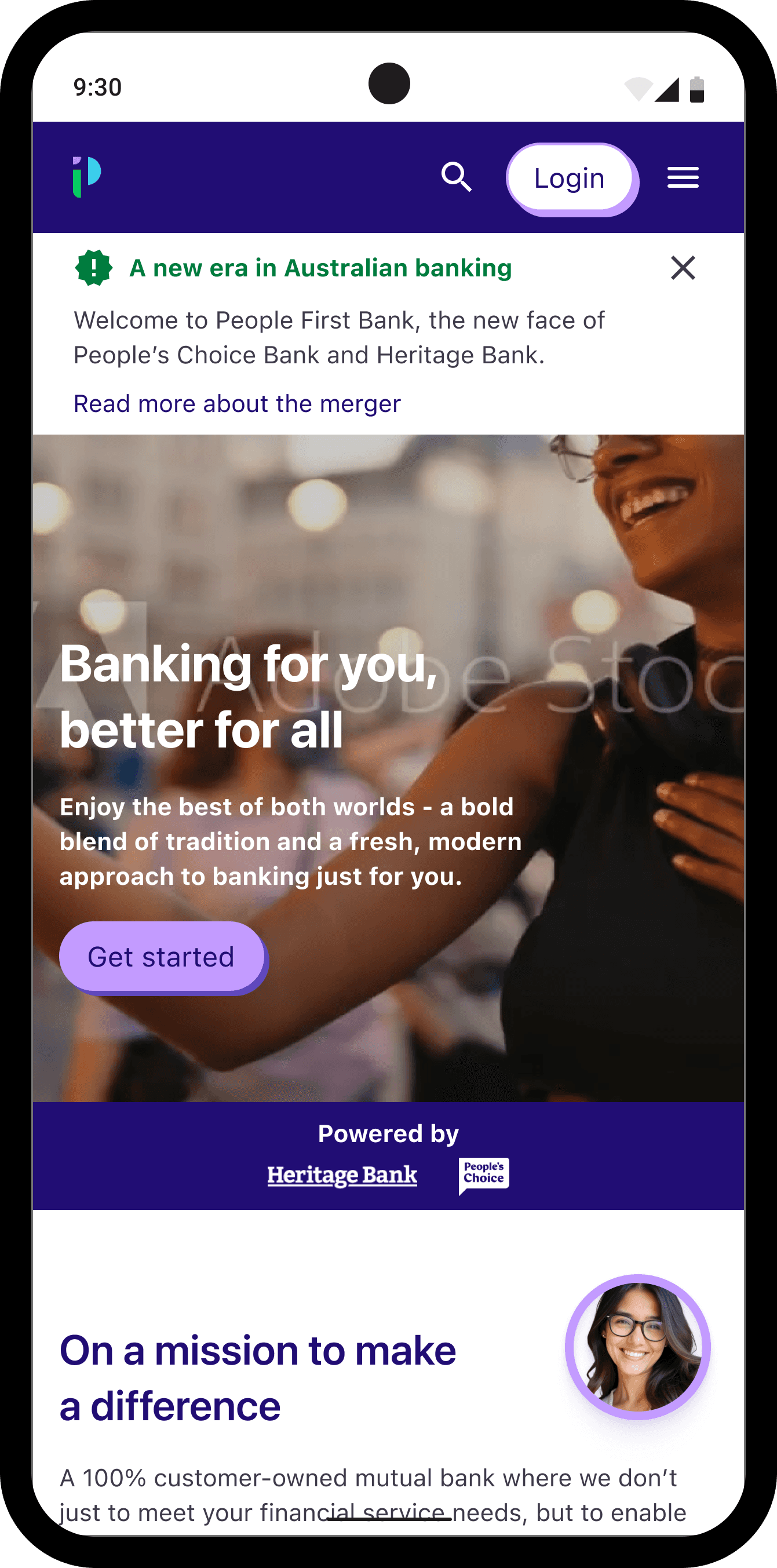
Iteration 2 - To follow a minimalistic design, I mimicked Up, Neo and Revolut's website clean look, which emphasises highly on less copy and a storytelling experience. I applied this through the webpages I was designing for the 'Sign up for a Savings Account' user flow. This laid out the groundwork for my first usability testing with 5 user participants.
Usability Testing 1 - Some insights I have gathered were:
Users skimmed past what makes People First Bank unique as a mutual bank
They liked seeing all the products and services grouped together
A few users had different methods of entering the ID verification details, i.e. manually entering or uploading evidence.
Iteration 3 - I added gradients to mimic how Up uses their bold brand colours and visuals. I made the webpages consistent by having a background with a strong CTA in the masterhead to engage users to either sign up or read more about their products/services. I also added a Review section in the application form, as one participant would like to read all the information he provided before creating his account.
Usability Testing 2 - This round showed a 100% user satisfaction in understanding what a mutual bank is, with some additional suggestions provided:
making the signup process more secure e.g. strong password, good security questions, 2-factor authentication
making the interest rates more transparent on Product pages
preferred images over gradient backgrounds used on the website
As you might have noticed, I removed the number of customers and years of operation at the top of the website from the first sketches. This is because over time, with an interactive video and copy in the masterhead, I didn't want to overload customers with information straightaway. Customers and users will see, as they progress further down the website, that the number of customers is shown.


Key Outcomes
"I liked your How Might We statement, you incorporated trust, one of our values, and you mentioned it numerous times." - Sarah Kelly (Experience Design Lead)

"The sign-up application was straightforward and easy to complete…" - Vanessa (Participant 2)

"I really liked the comparison table that you had..comparing the values of the brand, because normally you would see those comparisons for rates and products. Also with the Help icon, it was a great use of drawing out the fine print and supporting our goal of transparency" - Sheena Jamieson (Product Designer)
Next Steps
Refine the sign-up flow - based on feedback from the second usability test, one user expressed that there were too many steps to complete. Revising the progress stepper or reducing the number of clicks will help with this issue.
Perform A/B testing - discover how well the product pages perform based on the master head content, CTA words, or colour usage to engage users to sign up, learn more about the bank or compare different products.
Creating targeted landing pages for young audiences with different lifestyles - users have a mix of short-term (e.g. travel, saving goals) and long-term financial goals (home ownership, insurance). Creating marketing campaigns as a business goal can increase the sign-up conversion of new customers for these different user groups.