At FutureReady X, I delivered high-impact UI/UX design solutions for two fast-moving client projects. I transformed a complex technical topic into an engaging, interactive pillar page that balanced storytelling with accessibility for enterprise audiences. For Success Tutoring, I redesigned their franchise websites to improve lead conversions, clarify user flows, and align content structure with business goals.
The Success Tutoring project involved redesigning a franchise website for the Australian investor and business owner market. The goals are to create a digital experience that reflects the franchise's commitment to leading the education and tutoring sector, while also offering a seamless user experience.
The Goal
The project goal is to increase its conversion rate for the "Download info pack" and "Book a call" buttons, leading and nurturing users to connect with the team to learn more about starting a franchise.
The Problem - Franchising website wasn't converting investors
During discovery with the founder of Success Tutoring and the Project Lead, I have discovered that:
100 calls per month are booked, with little to no follow-up
Website leads came from their Facebook ad posts - the adult demographic is either working in a corporate job, or people looking to switch careers.
The target audience had a mixture of different feelings, the majority of them being uncertain about managing business finances, balancing other commitments, and being anxious about investment risk.
When asked how likely they would start a new franchise business, 30% were motivated by a new work-life balance and making an impact for the tutoring community.
My Strategy 🧠
This goal involved gathering existing data analytics of their website. Interestingly, the team didn't have Google Analytics embedded on their website, thus providing me with little to no research about their leads and/or clients. This spearheaded these decisions:
Stakeholder interview - From this call, the above problems were outlined, and a design strategy was proposed to showcase the community support of the Success Tutoring team, the current success of business owners and investors, and the positive ROI other franchises are achieving.
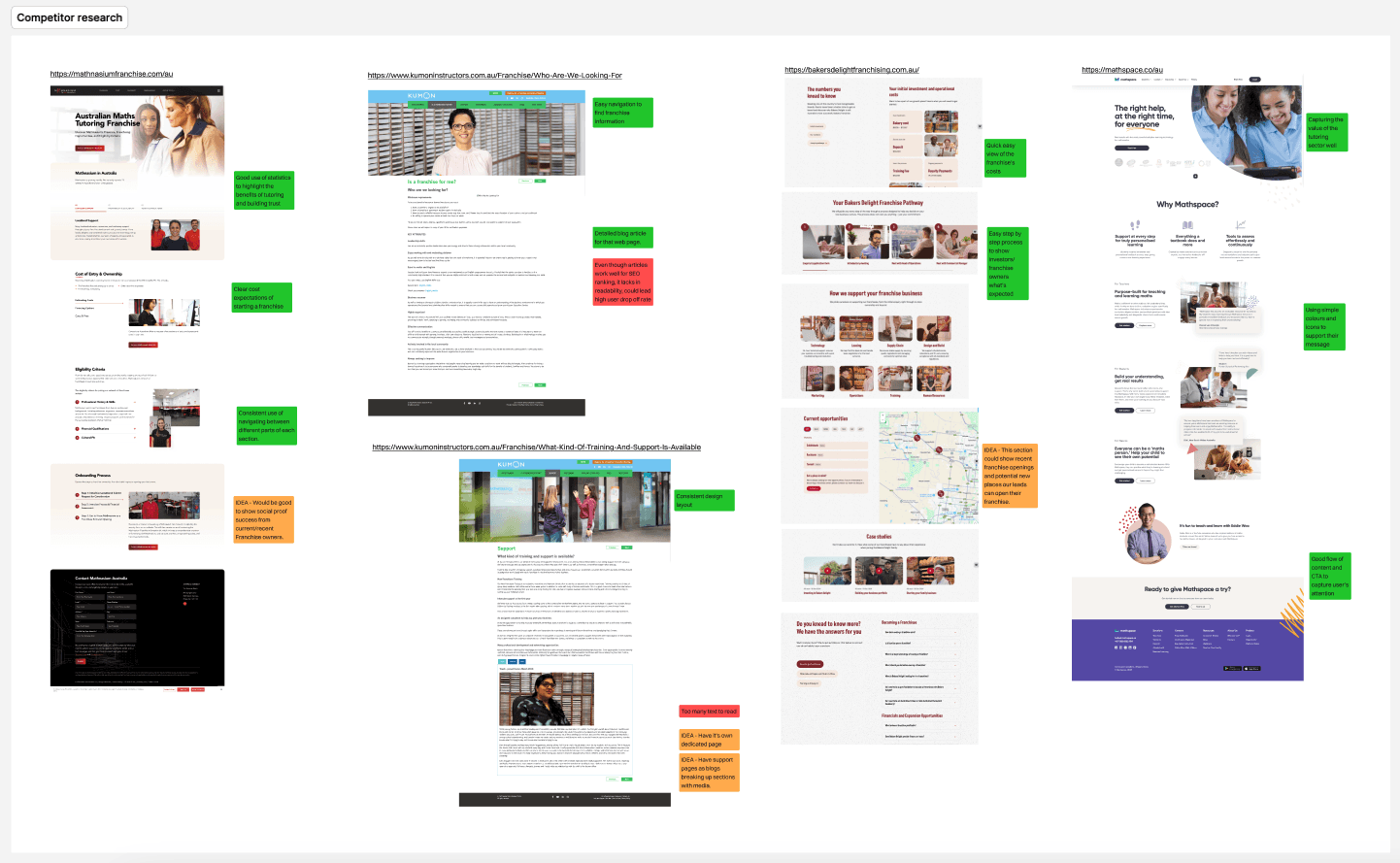
Competitor analysis - these insights above helped me to design webpages that would be useful for leads to understand the process of starting a new Success Tutoring franchise.
I did a heuristic analysis for the competitors above to identify what is already working for other successful franchises and what Success Tutoring can implement.
Audit their website to improve the "Book a Call" user flow and the "Download info pack" user flow
Design Decisions
I focused on a minimalist layout to create a better user experience and faster navigation for users to find franchise information.
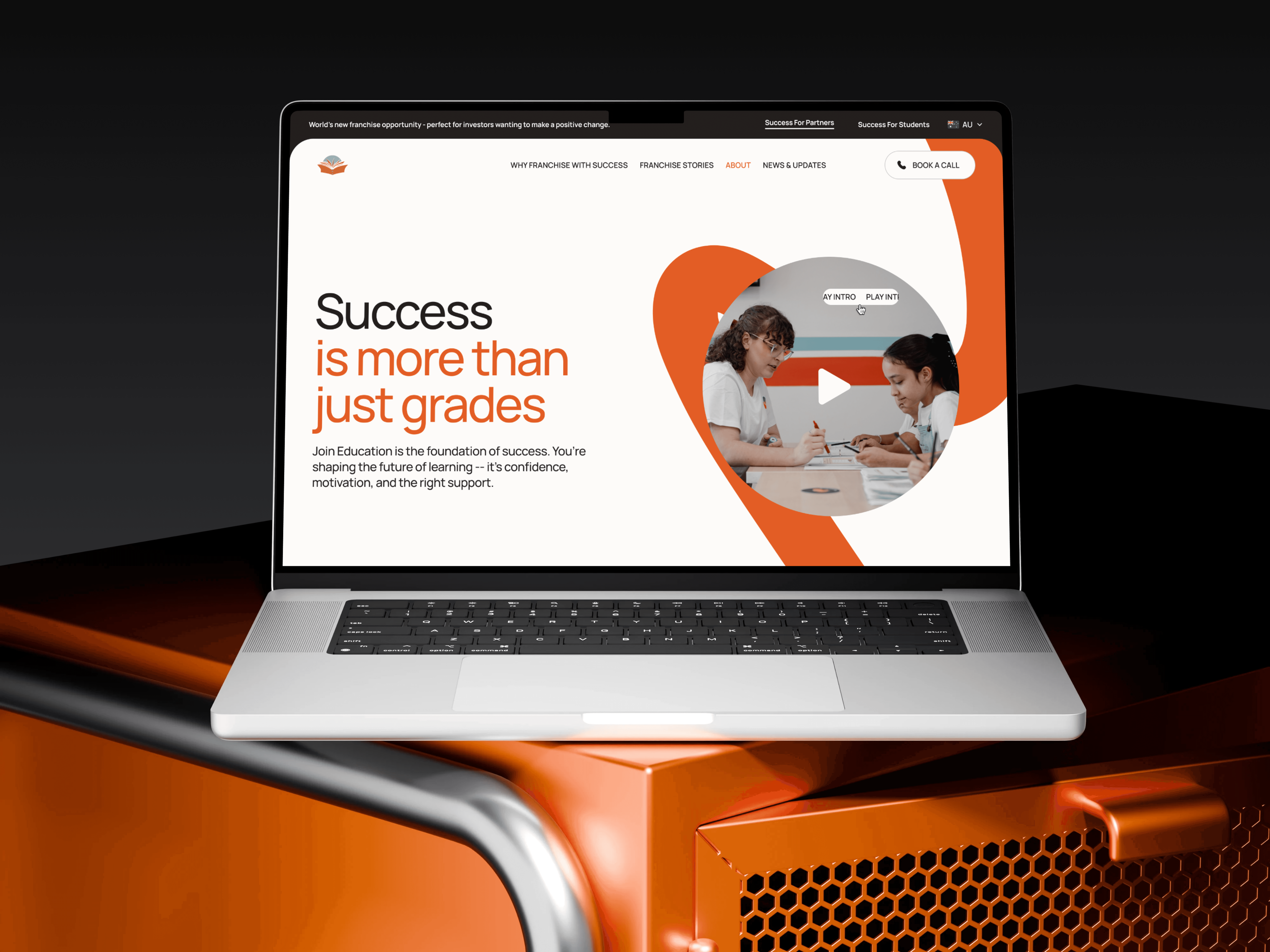
Making First Impressions Count for Investors
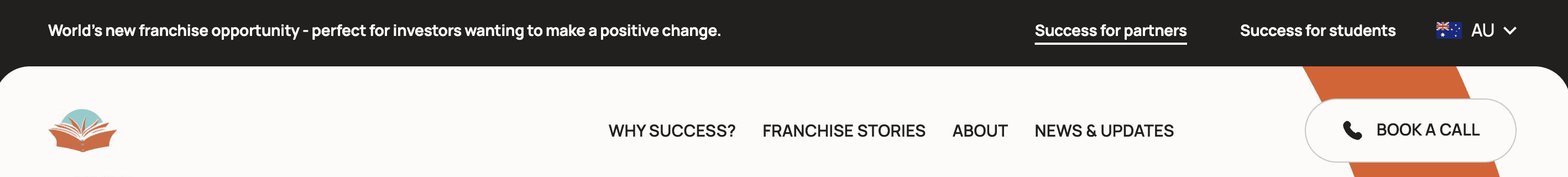
To reduce early drop-offs and create clarity for new users, I redesigned the homepage header as a separate element from the masthead. This allowed for a clear, confidence-building statement for franchise investors and introduced a simplified secondary navigation. Our research showed 18% of users dropped off when navigating the previous dropdown menus—this update provided faster access to key pages like “Students” and country selection, reducing confusion and friction.

Clearing Investor Doubts with Transparent Support Content
During research, we learned that prospective franchise investors had concerns about the support they'd receive after joining. Unlike larger competitors like Kumon or Mathnasium, Success Tutoring operates on a subscription-based model. To build trust, I repurposed the FAQ section into a structured Resource Hub—using CMS pages to communicate onboarding support, training, and operations help.
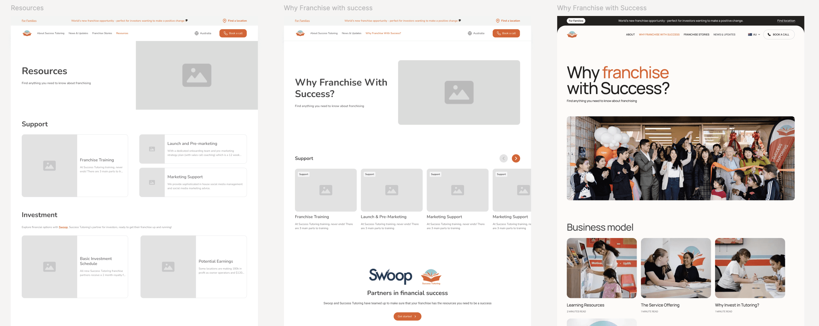
Design trade-off for faster implementation - To meet tight timelines and development constraints, I simplified the initial wireframe concept of the Resource Hub into a modular card-based layout. This allowed developers to repurpose existing CMS templates, significantly reducing build time. The original design was more dynamic but required complex logic that wasn’t feasible within our current sprint.
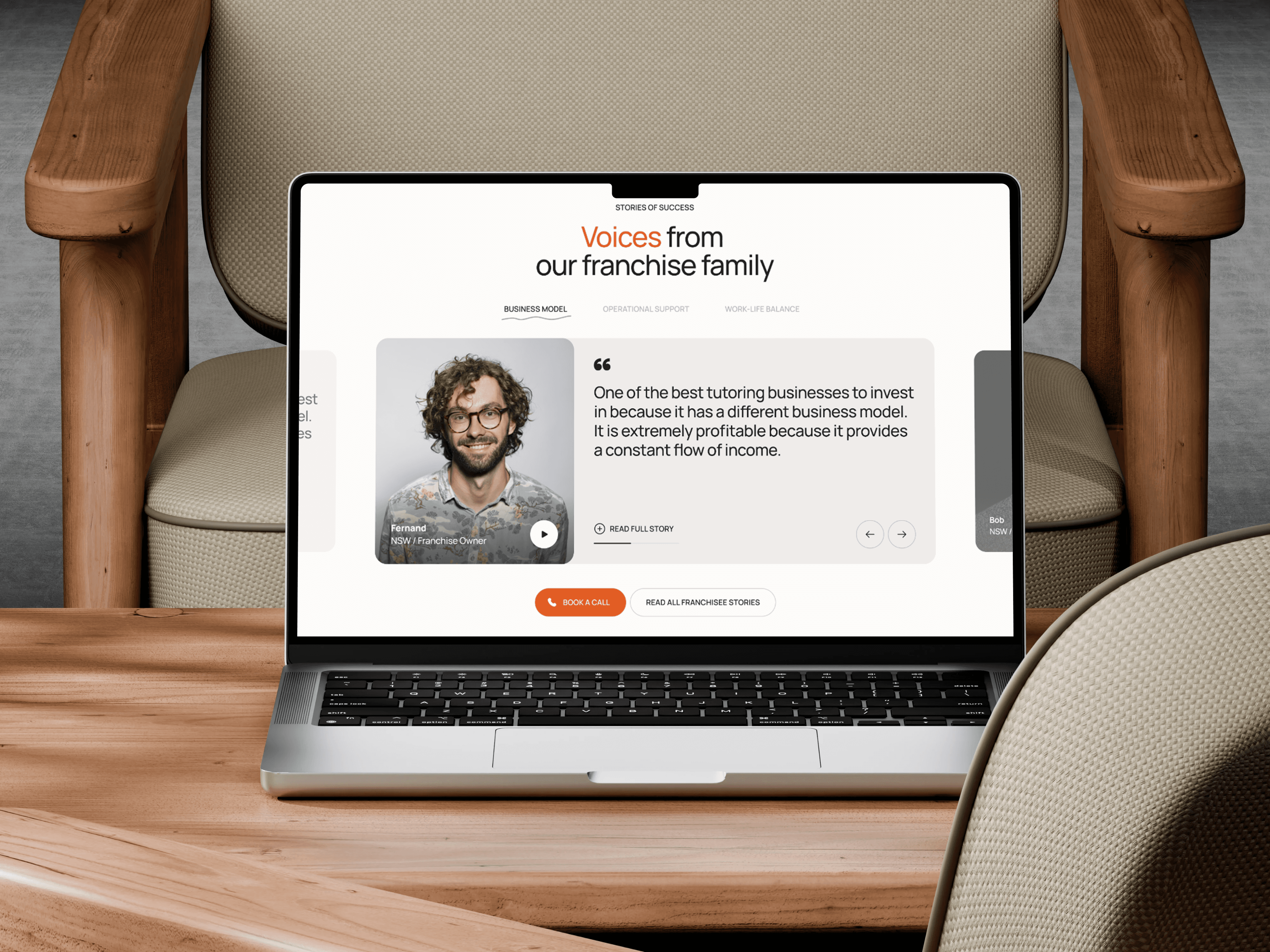
Building Trust Through Real Voices
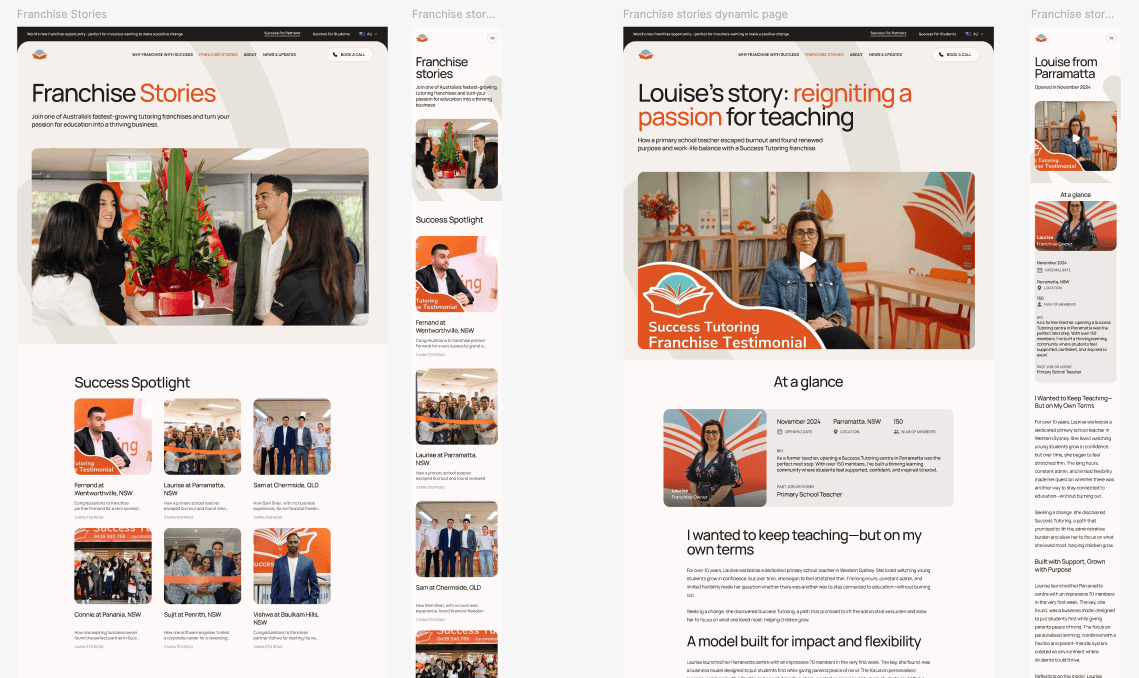
During my UX audit, I discovered that while Success Tutoring provided logistical resources (like FAQs and support guides), there was little storytelling from real franchise owners. To foster trust and build emotional connection with new leads—particularly investors and aspiring business owners—I created a dedicated “Franchise Stories” section.Unlike 'Why franchise with Success?' webpage, which focused on operational support, 'Success Stories' is designed to humanise the brand, featuring personal journeys, motivations, and success outcomes from current franchisees. Structuring it as a separate blog category with its own page helped spotlight each story while keeping navigation clean and user-focused.
This strategy draws from patterns seen in tutoring competitors, but positions Success Tutoring with stronger narrative clarity. It gives potential investors the inspiration and reassurance they need to take the next step—from curiosity to conversion.
Project Impact
Stakeholder Satisfaction - The client was highly satisfied with the final prototype and requested only minimal changes to a few components before implementation. This indicated strong alignment between the final design and stakeholder expectations.
Improved Structure & Storytelling for Leads - Redesigned key pages and content flows to align with how franchise prospects think and decide, introducing clearer navigation paths and focused storytelling touchpoints to build trust in the team's expertise.
Early Signs of Engagement (Metrics in Progress) - We are actively monitoring booked calls and time-on-page to evaluate impact, with early stakeholder feedback confirming improved clarity and direction.
"Overall excellent stuff. Very happy with how this is looking." - Michael Black, Founder
Reflection
This project taught me how to think strategically under time and resource constraints. With a small team and fast-moving deliverables, I learned to prioritise clarity, consistency, and scalable content structures that developers could implement quickly.
Although I wasn’t able to conduct user testing due to project limitations, I made decisions based on client feedback, stakeholder input, and benchmarking with competitors. If I had more time or access to analytics post-launch, I would measure how the new designs impacted lead generation, time-on-page, and clarity of the onboarding journey for prospective franchisees.
Going forward, I’d advocate for lightweight validation methods (e.g. heatmaps, short surveys, first-click tests) to support faster iterations without slowing delivery timelines.